ARGH THIS IS WEIRD so now there are new price tags. And guess what? My problem with the last ones were that they were too big, got in the way, and were pretty useless. Now they're the same, only BIGGER.
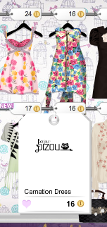
Tag 1. The average tag. Dude! Look how huge that is!! Look at all the empty white space!! It's bigger than the dress itself! What is the point of that??
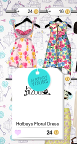
Tag 2. The you-own-it tag. Okay, there's this HUGE blank spot in the middle of the tag, and they decide to put the already yours thing over the logo? Sad.
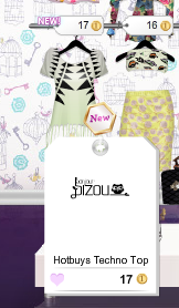
Tag 3. The "New!" tag. Really. Again with the misuse of space.
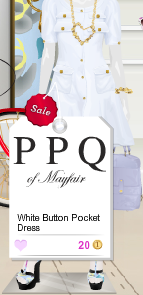
Tag 4. The sale tag. First of all, on this tag, PPQ is WAY too big. It draws my eyes there and i can't focus on the price or the name of the item. Anyways, this one isn't so bad, but the sale thing should be bigger. So, What do you think? This is bad, right? Comment.
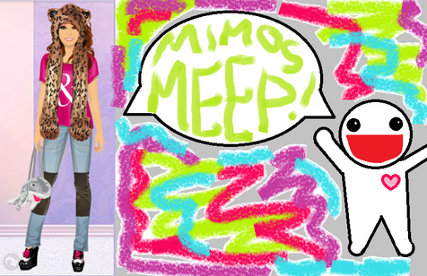
Mimosmeep :3
Mimosmeep :3
